Logo for Kid cudi’s collaboration with adidas originals
For kid cudi’s collaboration with adidas originals he wanted to have a new logo to represent his side of the collaboration. I had the opportunity to design it.
I worked on several directions and ideas for this logo drawing inspiration from the career of Scott Mescudi. As a fan of his music I already had the ideas and themes in mind that I thought might resonate.
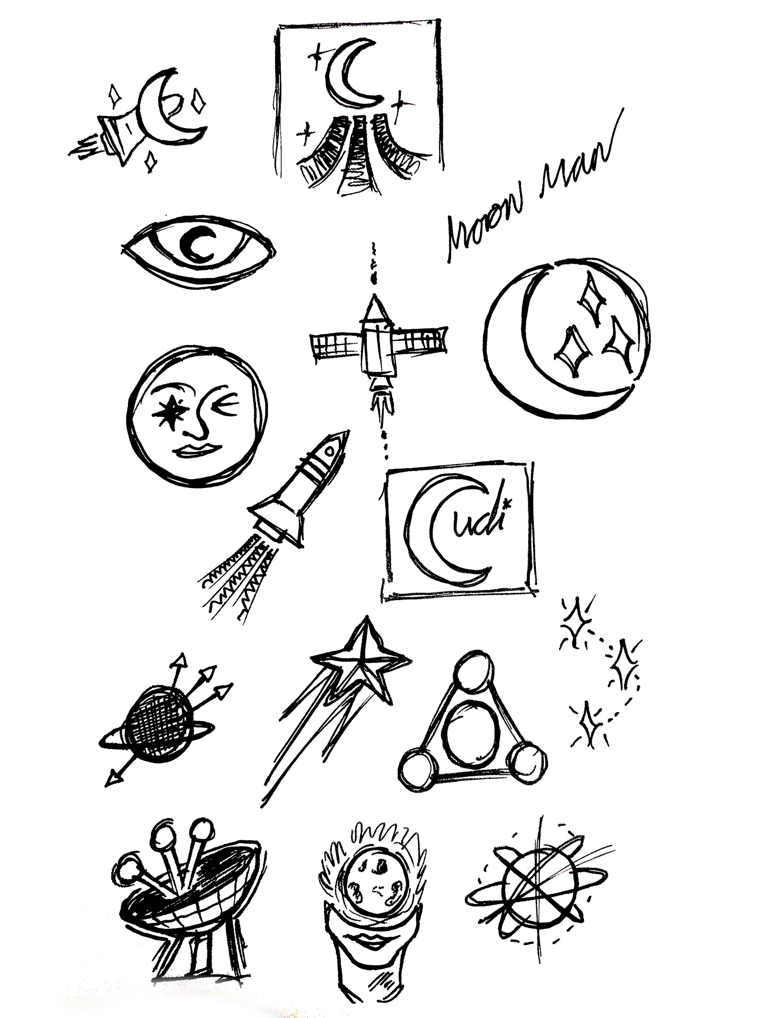
The final logo came from some small sketches I did as part of my research and exploration. It’s hand drawn, playful, simple and raw. I think that really reflects Kid Cudi and his music.
The logo is designed to be child like and playful at heart, with sophistication. The logo inspiration comes from the mood and feel of Kid Cudi and the themes of his music. It features a feminine head with a burning moon inside it. Sitting where the brain would normally reside. This represents a burning desire for knowledge and questioning of our surrounding space and the universe.. especially the moon. The flaming ‘halo’ represents a certain enlightenment of these inquiries.
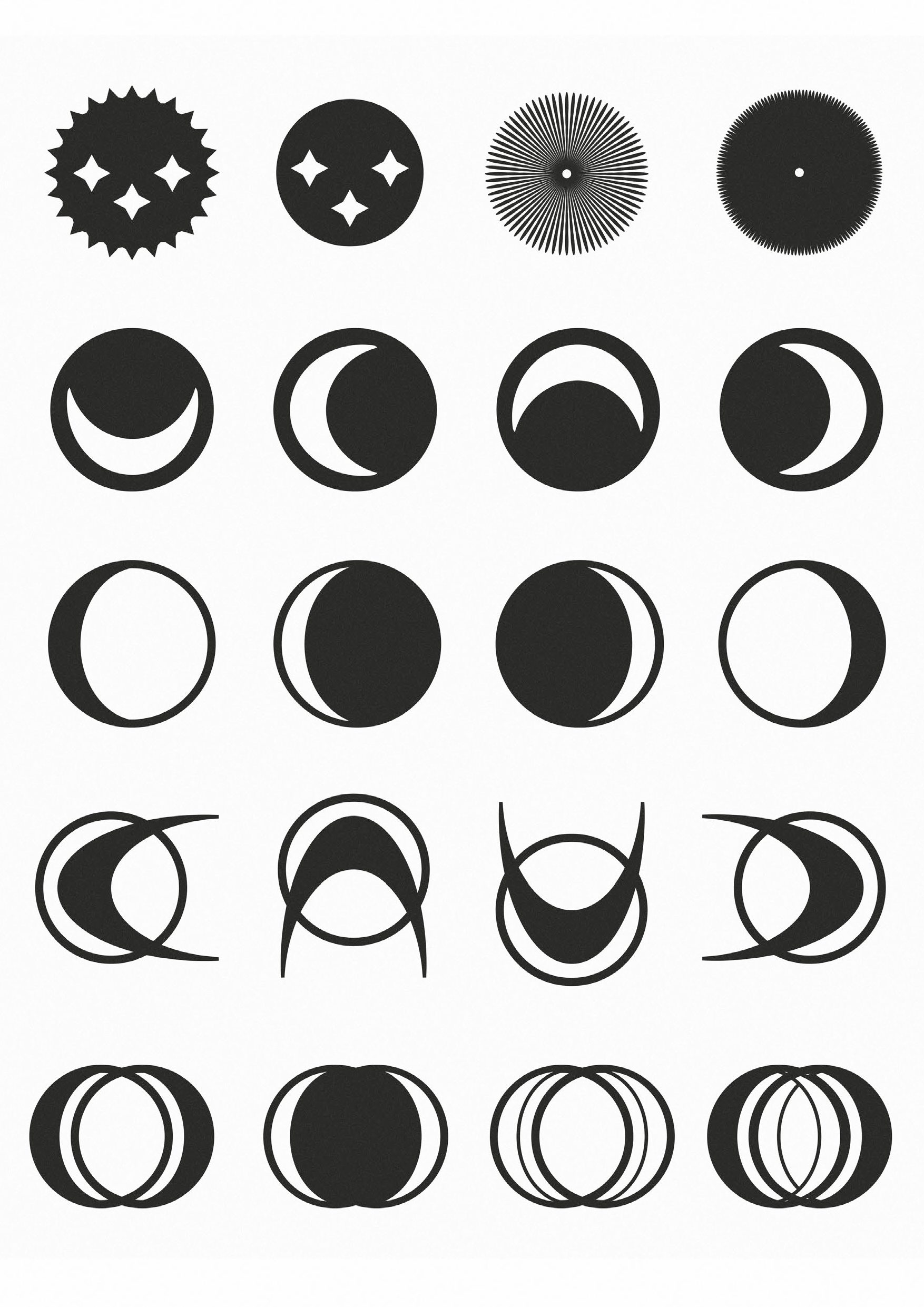
You can see below some examples of my alternative exploration and some original type that I created for his name.


